Colors have a profound impact on human emotions and behavior. In the world of graphic design and marketing, understanding the psychology of colors is a powerful tool for effectively communicating with your target audience. Whether you're designing a logo, creating a website, or developing a marketing campaign, the strategic use of colors can evoke specific emotions, influence perceptions, and ultimately drive consumer actions. In this blog post, we will explore the psychology

Red:
The color red is associated with passion, energy, and urgency. It grabs attention and stimulates excitement, making it an excellent choice for creating a sense of urgency in marketing campaigns. Red can also evoke strong emotions and appetites, making it suitable for food and beverage industries.

Blue:
Blue is often associated with trust, reliability, and calmness. It conveys a sense of security and professionalism, making it a popular choice for corporate branding. Blue is also known to stimulate feelings of productivity, making it suitable for technology and finance industries.

Yellow:
Yellow is a vibrant and energetic color that symbolizes happiness, optimism, and warmth. It grabs attention and stimulates mental activity, making it an effective choice for grabbing attention in marketing materials. However, excessive use of yellow can lead to anxiety, so it's important to use it in moderation.
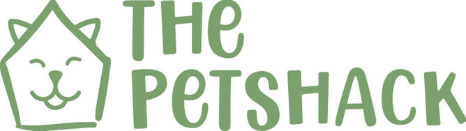
Green:
Green is closely associated with nature, growth, and health. It represents freshness, harmony, and sustainability. Green is often used by brands in the eco-friendly, organic, and wellness industries to convey a sense of environmental consciousness and well-being.
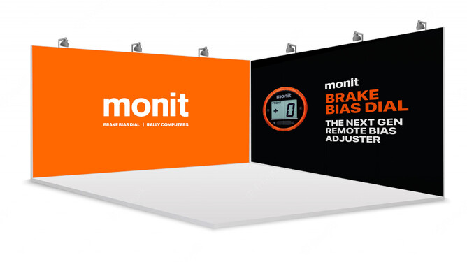
Orange:
Orange is a color that exudes enthusiasm, creativity, and adventure. It combines the energy of red with the cheerfulness of yellow. Orange is often used to create a sense of excitement and playfulness, making it suitable for brands targeting a young or adventurous audience.

Purple:
Purple is associated with royalty, luxury, and sophistication. It is often used to evoke a sense of elegance and exclusivity. Purple can also be associated with creativity and spirituality, making it a popular choice for brands in the beauty and artistic industries.
Black:
Black is a color that represents power, sophistication, and authority. It is often used to create a sense of luxury and exclusivity. Black can also be associated with mystery and elegance, making it a popular choice for high-end fashion and luxury brands.
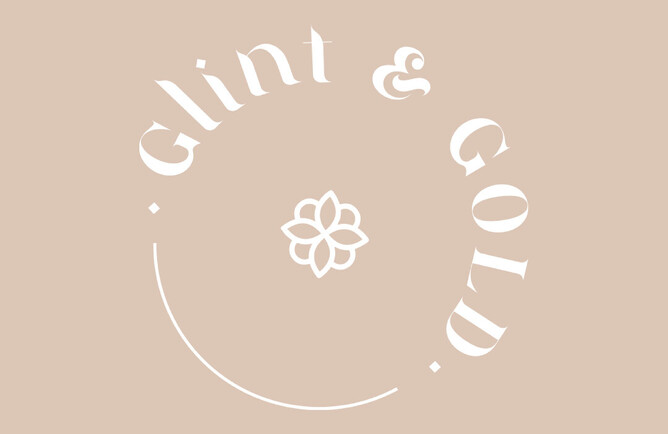
White:
White symbolizes purity, simplicity, and cleanliness. It creates a sense of spaciousness and can evoke feelings of calmness and serenity. White is often used as a background color in minimalist designs and can enhance the visibility and readability of other colors.
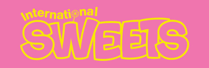
Pink:
Pink is often associated with femininity, romance, and playfulness. It creates a sense of sweetness and nurturance. Pink is commonly used in industries targeting a female audience, such as fashion, cosmetics, and lifestyle.
Multi-color:
Using multiple colors in graphic design can create a sense of vibrancy, diversity, and inclusivity. It can be effective for brands targeting a youthful or creative audience. However, it's important to maintain a balance and harmony among the colors to avoid visual clutter.