When I first sat down with James from McMaster Mortgages, it was clear his business had grown well beyond what his existing brand and website represented. As my own mortgage broker, I already knew the level of service he provides — so when he spoke about expanding into financial advice and investments, including KiwiSaver, it made complete sense that the brand needed to evolve with him.
The shift to Masters Financial marks a move from a mortgage-focused business to a broader, more holistic financial service offering.

April 2026 Silver Design Award
Incredibly proud to snap up the Silver Award from RocketSpark for this website.
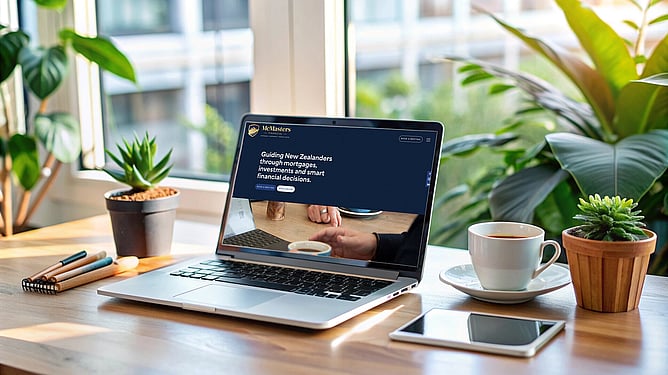
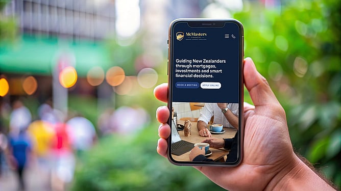
Jess from SWEA Design has nailed the fundamentals with McMasters Financial. Well-spaced content, a clear heading hierarchy, an intuitive user journey, and a design that looks just as good on mobile as it does on desktop. It's clean, focused, and easy to use, which is exactly what builds trust.

A refined identity with meaning
The rebrand centred around creating a logo that reflects both James’ background and the trust people place in him.
The shield icon represents stability, protection and reliability — key qualities in the financial space. Within that, the mountain form ties back to heritage and strength, grounding the brand in something personal and enduring. The upward arrow introduces a clear connection to finance, growth and forward momentum.
We kept the foundation of the existing brand colours but refined the palette by elevating the orange into a gold tone. This subtle shift adds a sense of quality and maturity while still maintaining familiarity for existing clients.

From a one-page site to a full digital presence
James’ previous website was a single page, which limited how much he could communicate about his services. With the expansion of the business, this was the perfect opportunity to build a more comprehensive website.
I designed and built a new site on RocketSpark, creating multiple pages that clearly explain each area of his services — from mortgages through to financial advice and KiwiSaver. This not only improves the user experience but also allows for stronger SEO through meaningful, structured content.
We also introduced a blog/insights section to share knowledge, case studies and updates, helping position Masters Financial as a trusted voice in the space.

Bringing the brand to life
To support the rebrand, I recommended bringing in a photographer to capture James and his new brand in a way that felt professional and approachable. Strong, authentic imagery plays a huge role in building trust, especially in the financial sector, and it helped tie the entire brand and website together.
This project was a particularly rewarding one. Not only was it about bringing a business up to the level it truly operates at, but it also felt like a full-circle moment — having worked with James personally to get into the property market here in New Zealand.
Being able to give back through design and help elevate his brand was a real privilege.
“I used Jess to rebrand my company and design a new website. She was brilliant at showing me different concepts and ideas. From the first meeting, she already had ideas on what would be needed to get the best information out there. If something needed changing or updating she was onto it super fast. Highly recommend. I've had so much great feedback from clients about the website already.”
Stock Mock Up Photos - magnific